
Smartphone screens capture most of our attention each day, so even small interface changes can reshape how people live, work, and communicate. User experience (UX) design sits at the center of this change. A smartphone no longer serves as a simple communication tool. It acts as a personal hub for social interaction, entertainment, finance, navigation, and productivity.Over time, smartphone
UX moved from physical keypads with tiny displays to full‑screen touch devices with gesture navigation, AI features, and adaptive layouts. Understanding this evolution helps UX designers and business owners make smarter decisions when building or improving mobile products. This guide walks through key milestones, current trends, and practical UX priorities.

The Evolution of Smartphone User Experience
Early mobile UX centered on hardware limits and communication needs. Devices offered tiny monochrome or low‑color displays, paired with physical keypads. The typical layout used a numeric pad, soft keys, and directional buttons.
Users navigated vertically through simple lists: contacts, messages, settings, and basic tools like alarm clocks.Designers structured menus in a strict hierarchy. Users often memorized sequences like “Menu > 2 > 1” to reach common features. This interaction model prioritized reliability over delight. Feedback came through simple sound cues, vibration, and basic on‑screen prompts. Because storage and processing power were limited, visual elements stayed minimal.Rise of Touchscreens and Gesture Navigation
The move to capacitive touchscreens changed smartphone UX more than any single hardware shift. Users could now tap, swipe, pinch, and scroll directly on content. This direct manipulation removed the distance between intention and action. Instead of pressing a key to move a cursor, users touched the item they wanted.On‑screen keyboards replaced physical keypads and allowed full‑screen layouts.
Designers could resize keys, show suggestions, and support multiple languages without changing hardware. Icons, grids, and home screens organized apps visually. Users recognized functions by color, shape, and position, not only by text labels.Key Elements of Modern Smartphone UX Design
Simplicity sits at the heart of strong smartphone UX. A simple interface does not mean a lack of features. Instead, it means careful choices about what appears on each screen and how elements relate to each other.
Designers strip away distractions and focus on the core actions users want to perform.Visual hierarchy helps users understand where to look first. Larger text, bold headers, and prominent buttons signal primary actions. Secondary options use lighter colors or smaller text. White space separates groups and makes content easier to scan. Consistent icon styles and color usage build familiarity and reduce confusion.
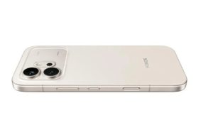
Users notice slow apps immediately, and they rarely forgive them. Performance directly shapes perceived quality. When an interface responds instantly, it feels intuitive and “light.” Delays, stutters, and long loading times create friction and break trust. This is especially true when users research products like the honor 600 price, where they expect fast-loading pages and smooth navigation to compare features and make decisions quickly.
Modern UX design treats performance as a core feature, not a technical afterthought. Designers and developers work together to streamline critical journeys. They minimize unnecessary steps, reduce heavy media where possible, and pre-load content for expected actions. Skeleton screens and progress indicators keep users informed during loading, which makes waits feel shorter and less frustrating.
AI now powers many visible and invisible parts of smartphone UX. Recommendation engines curate news, videos, and shopping suggestions. Keyboard apps learn a user’s writing style and predict words and emojis. Photo apps tag and group images by people, places, and events. These features reduce manual work and help users reach relevant content faster.Personalization extends into layout and feature exposure.
Systems may rearrange shortcuts based on frequent actions or surface widgets at specific times of day. For example, a phone might show commute information in the morning and media controls in the evening. UX designers map these scenarios and define how AI should react while staying predictable.
Foldable smartphones introduce a new challenge: the interface must adapt as the screen changes size and shape. When users unfold a device, the layout shifts from a compact phone view to a tablet‑like canvas. UX designers plan for both states and the transitions between them.Core tasks should remain smooth across modes.
For instance, a user might start reading an article on the folded screen, then unfold to see more text and images at once. The app should preserve scroll position, expand columns, and maybe reveal extra controls suitable for the larger view. Consistent gestures and navigation help users feel at home in both layouts.
Smartphone UX and interface design continue to evolve, but core goals remain steady: help people achieve their tasks quickly, clearly, and comfortably. The journey from physical keypads to full‑screen touch, gesture navigation, AI‑driven personalization, and foldable layouts shows how technology and human behavior shape each other.Modern UX work balances visual simplicity, clear hierarchy, fast performance, and inclusive design.
Trends like AI integration and adaptive interfaces extend capabilities while introducing new ethical and usability questions. Designers must guide these tools to support users rather than distract or confuse them.Understanding past milestones and present trends gives teams a practical framework for future decisions. By focusing on clarity, responsiveness, and respect for user attention, smartphone products can stay relevant in a competitive landscape and keep delighting users as devices and expectations change.