K-personal color analysis has turned into a full-on beauty pilgrimage. People fly to Seoul, sit under bright studio lights, watch a consultant flip through dozens of drapes, and leave with a new identity: a season label, a “best neutral,” a list of colors to avoid—and the holy grail, a Life Color that makes them look instantly brighter.
That “instant glow” moment is real. But the trip, the appointment, and the cost aren’t realistic for everyone. The good news is you don’t need to board a plane to get a practical, reliable starting point. With a structured, photo-based Color Analysis approach, you can do a color season test at home, understand your tonal dimensions, and build a color analysis palette you can actually use day to day.
This is where
AI Color Analysis comes in: an affordable way to run an AI personal color analysis online—then turn the results into smarter choices for clothing, makeup, hair, and accessories.
Why 4 (and even 12) seasons can feel “not specific enough.”
The classic seasonal system—Spring, Summer, Autumn, Winter—is a great entry point. It helps you understand the biggest axis in personal color: warm vs. cool, and generally lighter vs. deeper coloring.
But the reason so many people “graduate” from 4 seasons (and even 12 seasons) is simple: real faces aren’t evenly distributed into big buckets.
Two people can both be “Summer,” yet one looks best in airy, light, powdery shades while the other needs more depth and slightly stronger color. Or you might be warm-leaning but look overwhelmed by overly bright warm shades—so “warm” alone doesn’t solve your shopping decisions.
That’s why “cross-season” conversations are everywhere now. You might mostly match a warm autumn direction, but still borrow some softer, cooler-leaning shades that flatter you. This isn’t always a sign that the test is wrong—it’s often a sign that you’re close to a tonal boundary.
And that leads to what’s trending globally: color Analysis. Instead of asking only “What season am I?”, people increasingly ask:
-
Am I more Light or Deep?
-
Do I suit Mute (soft/greyed) colors or Vivid (clear/saturated) colors?
-
Is my overall contrast low, medium, or high?
Those questions are exactly what Korea’s more granular systems are designed to answer.
What Korea’s 16-season approach gets right: 4 types + “Life Color”
K-styling personal color systems became dominant because they give you more usable language. Rather than stopping at “Spring,” they refine how Spring shows up on you—often using tonal descriptors like:
-
Light: best in brighter, airier, higher-value colors
-
Deep: best in richer, darker, heavier-value colors
-
Mute: best in softened, greyed, lower-chroma colors
-
Vivid: best in clear, bright, high-chroma colors
This tonal “granularity” matters because it matches how people shop. You’re not buying “Summer.” You’re buying a cream sweater, a lipstick, a hair dye shade, and a pair of glasses. The color quality—light vs. deep, muted vs. vivid—often decides whether those items make you look fresh or tired.
And then there’s the term that hooked everyone: Life Color. In the Korean context, it means the one shade that makes you look like someone turned the lights on—clearer skin, brighter eyes, less visible shadowing, more natural definition.
Importantly, Life Color isn’t necessarily your favorite color. It’s the color that harmonizes with your natural tones so well that your face looks “alive” even with minimal styling.
AI Color Analysis workflow: selfie→ 16-season type → palette → Life Color
Once you have a clean, well-lit selfie, you can run an at-home analysis in a structured way. With AI Color Analysis, the flow is designed to mirror what people want from a modern Korean-style result—without the travel and appointment logistics.
Step 1: Upload a selfie
This is the core of any photo-based test: you upload an image and let the system evaluate your natural coloring. Many people search for a “color analysis upload photo free” option because they want a low-friction start; even when you’re choosing an affordable tool, the key is still the same—use a good photo.
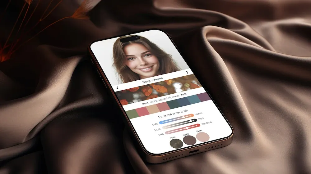
Step 2: Get your 16-season result + color dimensions
A 16 season color analysis doesn’t just output a label. The most useful results explain why the season fits you, typically through dimensions like:
This dimension breakdown is what makes the result actionable. It’s the difference between “I’m probably Autumn?” and “I look best in warm, muted, medium-to-deep colors with softer contrast.”
Step 3: Receive a color analysis palette you can use
A practical color analysis palette usually includes:
-
Neutrals (your wardrobe backbone)
-
Best colors (face-framing shades that lift you)
-
Colors to avoid (shades that create dullness, greyness, or harsh shadows)
Step 4: Turn “best colors” into a Life Color you can actually wear
Here’s a simple method:
-
Pick 6 candidates from your best colors (2 neutrals, 2 everyday colors, 2 bold colors).
-
Test them near your face (top/scarf/fabric) in the same lighting.
-
Choose the one that gives the clearest skin, brightest eyes, and most natural definition.
That winner is your Life Color—not as a trend term, but as a real decision tool.
Because this is color analysis online, you can repeat the process later if you change your hair, your tan level, or your makeup style. The ability to re-test is a big advantage of AI-driven workflows.
The key to “reliable” at-home results: your photo conditions
If you’ve ever tried a color analysis test photo online and felt confused by the result, the problem is often the input—not the concept.
In-person studios control the variables: lighting, distance, angle, background, and even how colors reflect onto your face. At home, you can get surprisingly close if you treat your selfie like a mini studio shoot.
Lighting: the biggest factor
-
Use indirect daylight (stand facing a window, but avoid harsh direct sun).
-
Avoid warm yellow indoor lighting—it can make cool undertones read warm and distort chroma (mute vs. vivid).
-
Avoid mixed lighting (window + lamp) because it creates inconsistent skin readings.
No filters, no “beauty mode.”
Turn off smoothing, whitening, and color grading. Filters change skin hue and contrast—exactly what a color analysis AI system needs to read accurately.
Show true skin + clear eyes
Pull hair away from the face and keep makeup minimal. You want your natural skin to be visible for AI skin color analysis to work properly.
Also, make sure your eyes are visible and not hidden in shadow. Think of it like “upload a photo for eye color analysis”—you don’t need an iris close-up, but clear eyes help the system interpret contrast and harmony.
Keep the environment neutral
Wear a neutral top (white, grey, beige) and use a plain background. Bright clothing or colorful walls can bounce color onto your skin and throw off your undertone and chroma reading.
If possible, take two photos in the same lighting: one straight-on and one slightly angled. Consistency is your friend.
How to use your color analysis results: bring them to life
A good color analysis is only as valuable as what you do next. The easiest way to make your results pay off is to apply them where color has the biggest impact: near your face.
Start with neutrals (your low-risk foundation)
Use your recommended neutrals for coats, knits, trousers, bags, and shoes. If your neutrals are right, everything else becomes easier to mix.
Think “build the base, then add Life Color.” Even one correct neutral can reduce the urge to overbuy trendy pieces that don’t match anything.
Prioritize the best colors for face-framing items
Your best colors work hardest when they’re close to your face:
-
tops and jackets
-
scarves
-
collars and necklines
-
earrings and necklaces
This is also where tonal nuance matters most. If your result leans Mute, slightly softened shades tend to look expensive and effortless on you. If you lean Vivid, cleaner, clearer colors often make you look sharper and more awake.
Use “colors to avoid” strategically (not as a ban list)
“Avoid” doesn’t have to mean “never wear.” It can mean:
-
keep that color away from your face (wear it as pants or shoes)
-
choose a softer or deeper version of the same hue
-
change the fabric finish (matte vs. shiny can change intensity)
Makeup and jewelry: quick wins from tonal dimensions
-
Lip and cheek color often follows your chroma: muted people tend to look best in softer, diffused shades; vivid people can handle cleaner, brighter pigment.
-
Metals often follow undertone: warm-leaning results usually harmonize with gold tones, cool-leaning results with silver tones (and many people can wear both, depending on intensity).
-
Scale and contrast: if your natural contrast is low, very high-contrast makeup or chunky black accessories can overpower you; if your contrast is high, you may need stronger definition to look balanced.
Bonus: lock it in with virtual try-ons
Once you have your palette and Life Color, the smartest next step is validation. Virtual tools help you test high-impact choices before you spend money.
Hair: the biggest “color amplifier”
Hair color can shift how your entire palette behaves. With hair color try on tools—especially a virtual hair color try on—you can test:
-
warm chocolate vs. cool ash brown
-
soft black vs. jet black
-
muted copper vs. bright orange-red
-
lighter highlights vs. a deeper, more solid base
If the platform includes an AI hair color changer, use it like a low-risk lab: experiment with direction first, then bring the closest real-world reference to your stylist.
Glasses: face-framing color you wear every day
Frames sit right next to your skin and eyes—exactly where your best colors matter most. A
virtual glasses try on makes it easy to compare:
-
black vs. brown vs. clear frames
-
warm tortoiseshell vs. cooler grey/black tones
-
gold vs. silver hardware
-
thin vs. bold frames (contrast matters here)
The “right” pair often looks less separate from your face—more integrated and flattering.
Outfits: turn palette theory into daily looks
An AI outfit generator can take your palette and help you build combinations that feel cohesive, not random. A simple formula that works for many people is:
This is especially useful for:
-
planning travel capsule wardrobes
-
building work outfits quickly
-
avoiding purchases that don’t integrate with what you already own
When you can generate outfit ideas aligned with your color analysis palette, you reduce trial-and-error, and the “closet full of nothing to wear” problem starts to fade.
Final thoughts: you don’t need Seoul to find your Life Color
Korea’s 16-season trend is popular for a reason: it gives people a more precise tonal map—and that map leads to better decisions. But the value isn’t the plane ticket. The value is understanding your dimensions, owning a usable palette, and identifying a Life Color you can wear on repeat.
If you want a practical, budget-friendly starting point, do a structured color season test at home. With AI Color Analysis, you can run an affordable AI personal color analysis online, get a clear 16 season color analysis result, and turn it into real-world wins—better neutrals, smarter shopping, more flattering makeup, and confident choices in hair, glasses, and outfits.